Source
https://videohive.net/item/vox-style-data-report-infographic/65610075
Category
File Size
69 MB
Publisher
videohive
Updated
October 29, 2026
Description
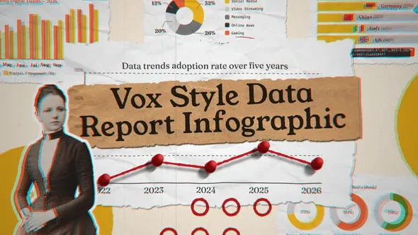
Turn raw numbers into compelling visual narratives with Vox Style Data Report Infographic — a bold, editorial-inspired motion template built for journalists, analysts, researchers, content creators, and digital publishers. Channeling the distinctive aesthetic of modern data journalism — torn paper textures, vintage photographic cutouts, chromatic aberration overlays, and rich amber-and-crimson color palettes — this template transforms dry statistics into visually arresting, story-driven infographic sequences that demand attention. Whether you’re reporting on digital trends, global market data, or multi-year adoption rates, Vox Style Data Report Infographic delivers the editorial gravitas and visual wit your audience expects.
- Editorial Torn-Paper Aesthetic: Signature ripped kraft-paper banner overlays and layered collage-style backgrounds evoke the tactile, analog charm of investigative print journalism — juxtaposed against crisp digital data visualizations for a striking, award-worthy contrast.
- Animated Line Charts with Data Points: Smooth, story-driven line graph animations trace multi-year data trends (2022–2026) with bold red data-point nodes that snap into position frame by frame — making trend storytelling feel dynamic and purposeful.
- Donut & Pie Chart Sequences: Animated segmented charts break down category distributions — including Social Media, Video Streaming, Messaging, Online News, and Gaming — with clean percentage reveals and color-coded legend callouts.
- Country Comparison Bar Charts: Horizontal bar chart animations with national flag icons display regional breakdowns for countries including Germany, China, Italy, and the UK — ideal for global research reports and international market analyses.
- Monthly Digital Trends Bar Graph: A vertically stacked multi-bar graph spanning monthly intervals (May through September) animates with staggered entrance effects — perfect for presenting longitudinal engagement and adoption data.
- Vintage Photographic Cutout Elements: Retro black-and-white portrait cutouts with chromatic aberration RGB-split effects add a bold, magazine-editorial personality that sets this template apart from generic corporate data presentations.
- Progress Ring Indicators: Animated circular donut rings display audience outlook statistics with bold percentage callouts — communicating forward-looking survey data like AI adoption expectations and data preference insights.
- Bold Display Typography: Large-scale, high-contrast serif and display fonts deliver headlines with commanding editorial weight — easily swapped to reflect your publication’s voice and brand identity.
- Rich Amber, Crimson & Charcoal Palette: A warm, journalistic color system rooted in deep golds, burnt oranges, reds, and near-blacks creates a cohesive visual identity across every chart type and infographic module.
- Fully Customizable: Update all data values, chart labels, country names, percentage figures, category titles, and color accents to match any dataset or brand guideline with ease.
- Modular Scene Architecture: Every infographic section is independently structured, allowing you to assemble, reorder, or extend sequences to fit short social reports, long-form documentary segments, or broadcast news packages.
- Full HD & 4K Ready: 1920×1080 and 3840×2160 compositions at 29.97 fps.
- No Plugins Required
- Well-Organized Project Structure
- Video Tutorial Included
- Free Fonts Included
- Images not included in download.
Video Preview
Download File