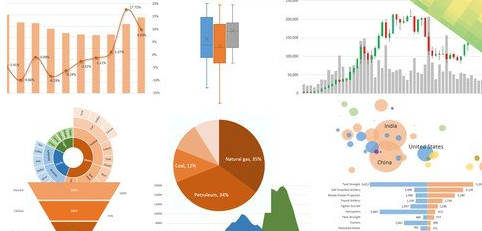
Data visualization transfers data into insight through charts or graphs. It makes it easier to identify trends and patterns instead of looking at large data sets in a spreadsheet/tabular.
When it comes to visualization tools, Excel offers a significant number of built-in charts for its ease of use and flexibility. Anyone with access to that spreadsheet can create various types of charts/graphs in a meaningful way. Excel allows users to generate a chart in just a few clicks and enable them to customize that chart easily such as adding titles, axes, labels, colors, etc.
This course provides you with a laser-focused, 100% comprehensive understanding of the latest Excel visualization tools. I’ll help you take all of the basic Excel visualization techniques and apply them in real-world applications. From there, we’ll explore over 22 different chart types available in Excel 2019(version 2016 and Microsoft 365 are also available) such as:
- Column chart
- Bar chart
- Line chart
- Pie chart
- Waterfall chart
- Candlestick chart
- Area chart
- Scatter plot
- Bubble chart
- Treemap chart
- Sunburst chart
- Radar chart
- Lollipop chart
- Dumbbell chart
- Box & Whisker plot
- Histogram
- Pareto chart
- Funnel chart
- Sparkline chart
- Heatmap chart
- 3-D surface chart
- Contour chart
- Tornado chart
- Combo chart
- And more…